Brooks Brothers: Website Design
Project Description
Develop a series of landing pages within the Product Innovation section of the existing e-commerce website that captures the innovative and unique features of the Brooks Brothers product offerings across three key categories.
Objective
Tell the story of Brooks Brothers contribution to innovation in apparel through compelling content, interactive features and functionality that are on-brand and consistent with the look and feel of the existing website.
What I did
• Research
• Wireframes
• Site Architecture
• Content Strategy
• User Interface Design
• Visual Design
• Image Retouching
• Functional Annotations
• Interactive Prototype
Phase 1
Competitive Research
I conducted a landscape analysis of Brooks Brothers direct and indirect competitors to assess how they were presenting similar content on their sites. I focused on page layout, use of iconography, image selection, video integration and interactive design features that we could leverage for the Product Innovation pages.
Phase 2
Wireframes
The framework of the Product Innovation pages were created using annotated low-fidelity wireframes to help define the overall structure and key features of each section. It was important that the content layout and hierarchy of each page could tell a unique and compelling story that was consistent with the look and feel of the existing website.
Fabrics & Materials
Engineering & Design
Sourcing & Manufacturing
Phase 3
Navigation
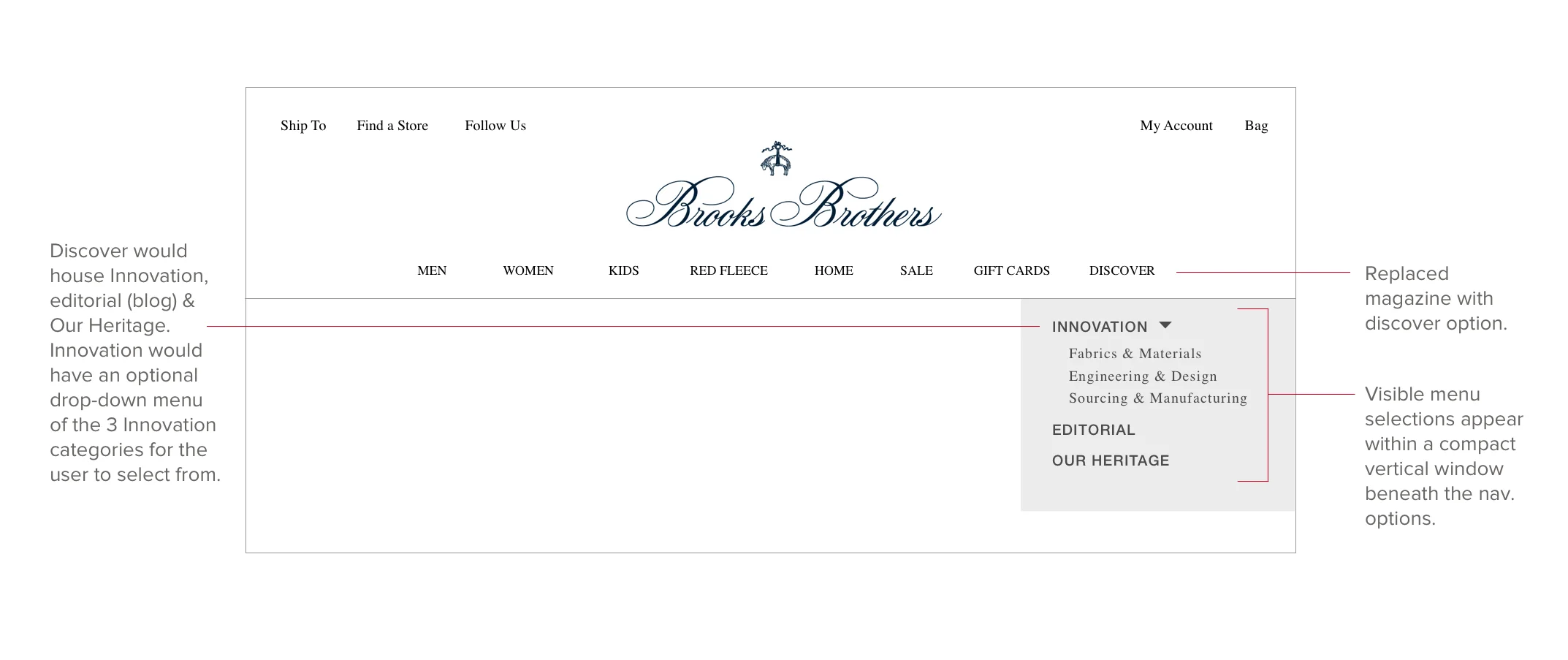
I developed a series of navigation layouts to outline how a user could potentially access the Product Innovation pages through the primary navigation.
Final Selection
The final selection included a new section called Discover containing sub-pages with direct access to the Product Innovation pages and some pre-existing pages. When a user clicks Discover it opens a list of menu options. If the user selects Innovation a list of the three Product Innovation is made available for users to choose from.
Phase 4
Page Navigation
We wanted our audience to have visibility and access to the other two Product Innovation pages without having to rely just on the primary navigation. The below wireframes are the options I presented to our internal team members for consideration.
Final Selection
It was decided that the below wireframe was the most suitable format for the Product Innovation pages as the look and feel is on-brand with other elements of the existing website and the buttons would convert easily in a mobile layout.
Phase 5
Information Architecture
We wanted the Product Innovation pages to be accessible and easily located through the main navigation without disrupting the existing site architecture. It was decided that the Discover section was the ideal location to house two existing pages: Editorial and Our Heritage in addition to the new Product Innovation pages. I felt that both the nomenclature and its location within the primary navigation made the most sense. The sitemap also outlines how the Product Innovation pages use different calls-to-action providing direct access to their corresponding product pages in other sections of the site.
Phase 6
Responsive Compatibility
The below mock-ups of the Fabrics & Materials page show how the page content and design components respond across multiple devices.
Mobile
Tablet
Desktop
Phase 7
Interactive Overlays
Throughout this project I was tasked with developing interactive features throughout each of the Product Innovation pages. The live site includes interactions that enable a user to click and / or hover over specific assets that trigger overlays, change color and resize images. Here are some examples.
Where is it Made : Desktop
The Sourcing & Manufacturing page includes an interactive map where users can click on a location pin that opens an overlay with information about the factory within that specific location.
01. Choose a location
02. Click a location pin
03. View country description overlay
Where is it made : Mobile
The mobile version of this interactive feature had to be modified to accommodate smaller viewports. The modified version includes a button titled "Choose A Country" that when clicked activates a menu with a list of the different countries they can choose from. When a user makes a selection another screen appears containing the information about the factory within that specific location.
01. Tap call-to-action
02. Tap a country from the list provided
03. View country description
Anatomy of a Shoe : Desktop
When a user hovers over a marker it spins clockwise and changes color letting the user know there is more information available. On click an overlay appears containing a detailed description about that specific section of the shoe.
01. Click a mark to learn more
02. View overlay description - click anywhere outside the overlay to close
Phase 8
Functional Requirement Documentation
I developed high-fidelity wireframes with detailed annotations that were used to inform the development team and project managers with all functional specifications of each of the visual components throughout the Product Innovation pages.
Action
Describes the physical interaction taken by the user (ie. click, hover, scroll etc…)
Reaction
Describes the outcome and / or result of that specific action (ie. fades in, color change etc...)
Hex #
The color hex code describes the RGB composition of that particular color.
Image / Video Location
Provides the location of that specific image or video (ie. URL, assigned file location, etc…)
Reference
Provides a visual reference (ie. URL, interactive prototype etc…) for additional support and improved clarity on the action & reaction of that specific functionality.
Sourcing & Manufacturing
Fabrics & Materials
Engineering & Design
Phase 10
Website Deployment
Prior to deployment I met with our Project Managers, Copywriters, Designers and Front-End Developers to walk them through the interactive prototype and functional annotations and address any outstanding issues.
The completed pages of the Product Innovation section of the Brooks Brothers site went live in July of 2018.


