Taxpayer Advocate Service: Website Redesign
https://www.taxpayeradvocate.irs.gov/
Description
The Taxpayer Advocate Service (TAS) is an independent organization within the Internal Revenue Service (IRS). They partner and advocate for the American taxpayer by ensuring they are treated fairly and know and understand their rights.
They assist taxpayers in navigating the complexities of the US Tax system by helping individuals with specific tax problems and recommend “big picture” or systemic changes to Congress, the IRS or in our tax laws. They are equipped with a full-range of expertise, capabilities and experience to help protect taxpayers rights and effectively manage their experience with the IRS, and to proactively prevent current and future problems.
Objective
The objective goal of TAS is to translate the intricate, and often convoluted processes of the IRS into more digestible formats through a digital online toolkit, equipping the US Taxpayer with the tools and confidence necessary to independently resolve their IRS questions, concerns and issues.
What I did
• User Personas
• User Journeys
• Landscape Analysis
• Site Architecture
• Feature Set
• Wireframes
Approach
There were two deliverables for this project.
Printed Map
A printed map that illustrates the different stages of a taxpayer’s journey, from getting answers to tax law questions all the way through audits, appeals, collection and litigation. It reaffirms the complexities of the entire modern United States tax system with all its connections, overlaps and repetitions between stages.
Website Redesign
A redesign of the existing TAS website would include a complete transformation of the look and feel (in partnership with another agency) combined with significant updates to the user experience that would enable visitors to easily find the critical information they are looking for. The goals and intentions of this website redesign include:
• Clear and actionable information that supports taxpayers facing challenges with the IRS
• Ensure taxpayers are aware and understand their rights
• Educate taxpayers about where they are in the taxpayer journey, including the implications and options at each step
• Clearly articulate what TAS is and the role it plays in support of taxpayer rights and issue resolution
The website redesign would also provide an efficient scaleable framework that would enable TAS content managers to easily edit, post and display new website content as needed.
Taxpayer Roadmap
Phase 1
Taxpayer Roadmap : Printed
In 2019 I traveled to Minneapolis Minnesota to participate in a live working session with our internal counter-parts to architect the printed roadmap. We collaborated with our visual designer to outline a draft of the different sections of the map and how they came together while also vetting
create one cohesive map that encompassed all 7 existing maps outlining the individual sections of the tax system.
We worked with members of the TAS team and internal partners to establish a theme and visual format for the roadmap would be used to tell the taxpayer journey. Some of the inspiration was derived from the infamous Paris subway
The outcome was a Taxpayer Roadmap is a 2D visual illustration of the entire modern United States Tax System. It’s comprised of 7 separate maps that were featured in Annual Report to Congress. that would be developed into one consolidated Taxpayer Roadmap with a cohesive look and feel intended to be released with the next Objectives Report to Congress.
The final outcome was a 2D foldable pamphlet that illustrates the entire United States Tax System, from getting answers to tax law questions, all the way through audits, appeals, collection and litigation. It shows the the numerous twists and turns, connections, overlaps and repetitions throughout our very complex and intricate American tax system.
Website Redesign
Phase 2
Data and Analytics Audit
In order for our team to understand how users engage with the existing site we conducted a data and analytics audit with a focus on 3 key areas:
Page Level Information:
Top content, entry pages and site exploration, page bounce rates
Interaction with the site:
Header/footer, onsite search, social
plug-ins
Visitor information:
Age, gender and device usage
Phase 3
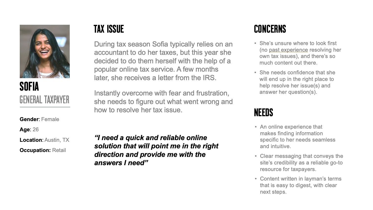
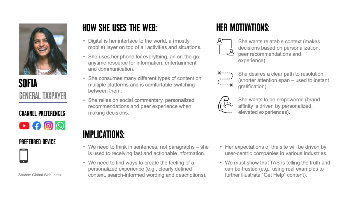
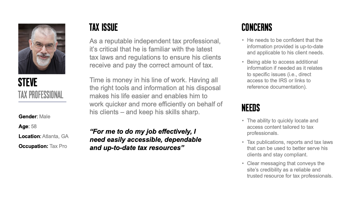
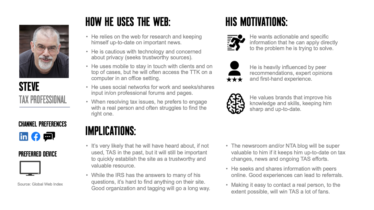
User Personas
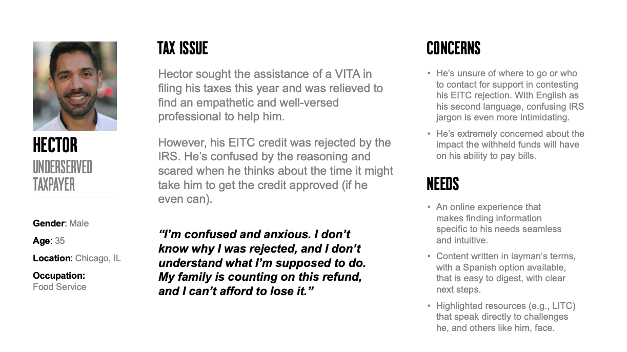
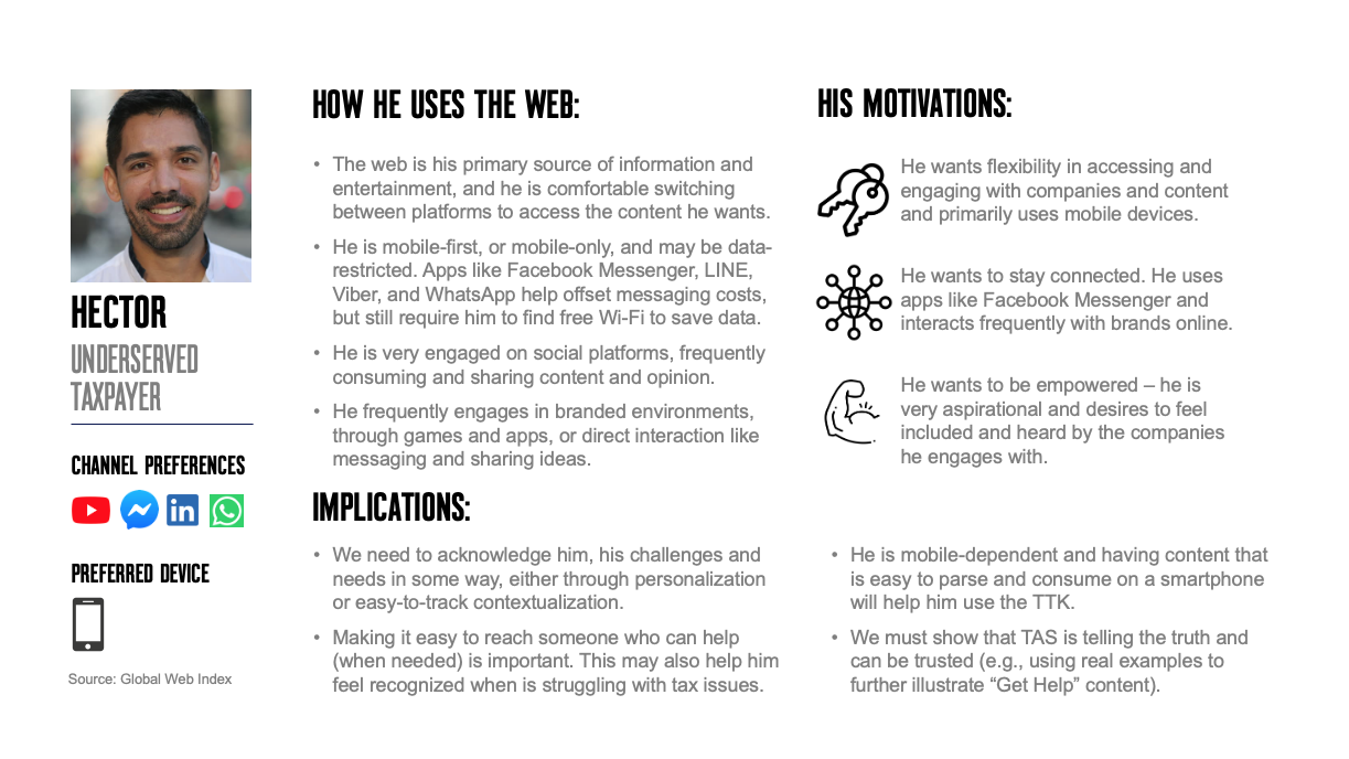
To better understand the needs and goals of our audience we created fictional characters to represent the key groups identified during research and stakeholder interviews from a late 2018 Webmasters Survey. These profiles were reviewed and updated based on feedback received at the 2019 Tax Forums.
The personas helped ground us in the mindset of our audience so we could tailor the new experience to meet each where they are in their journey and serve them more effectively, helping alleviate the stress and anxiety we know many experience in dealing with tax issues.
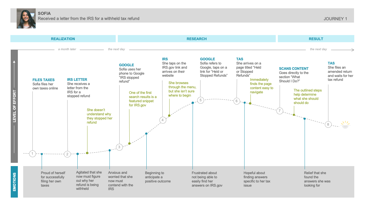
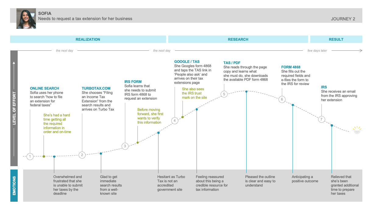
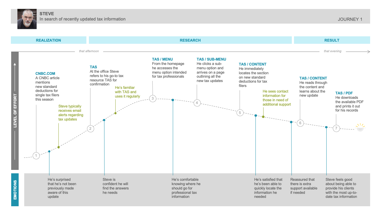
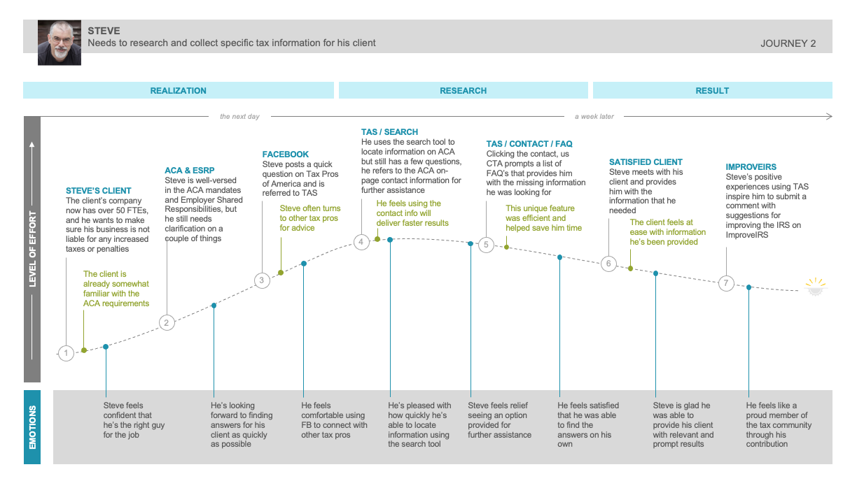
User Journeys
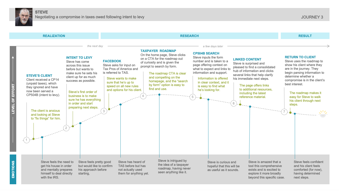
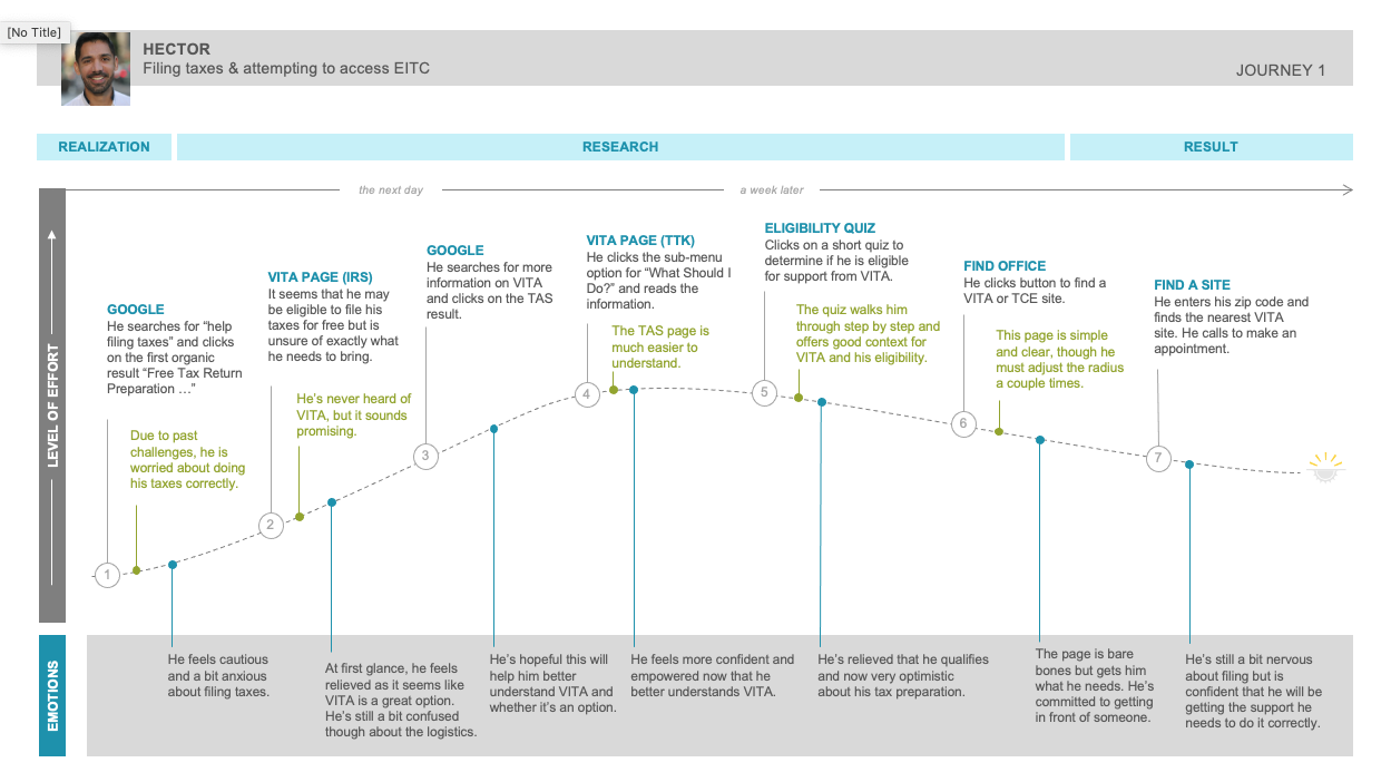
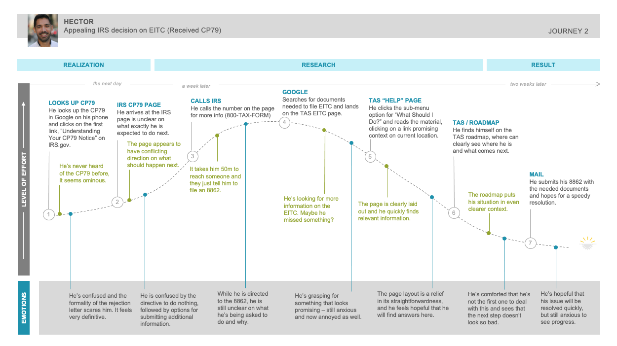
The user journeys depict the ideal paths of our personas and helped illustrate the multiple channels of interaction and touchpoints a visitor would encounter over an extended period of time until he or she achieved their intended or desired outcome.
What we identified:
• Their goals and intentions and how they were achieved
• The various touchpoints used to complete their journey
• The different emotions experienced at each touchpoint
• The length of time it took them to complete their journey
Sofia General Taxpayer
click / tap persona to view more
click / tap journey to view more
Steve Tax Professional
click / tap persona to view more
click / tap journey to view more
Hector Underserved Taxpayer
click / tap persona to view more
click / tap journey to view more
Phase 4
Feature Set
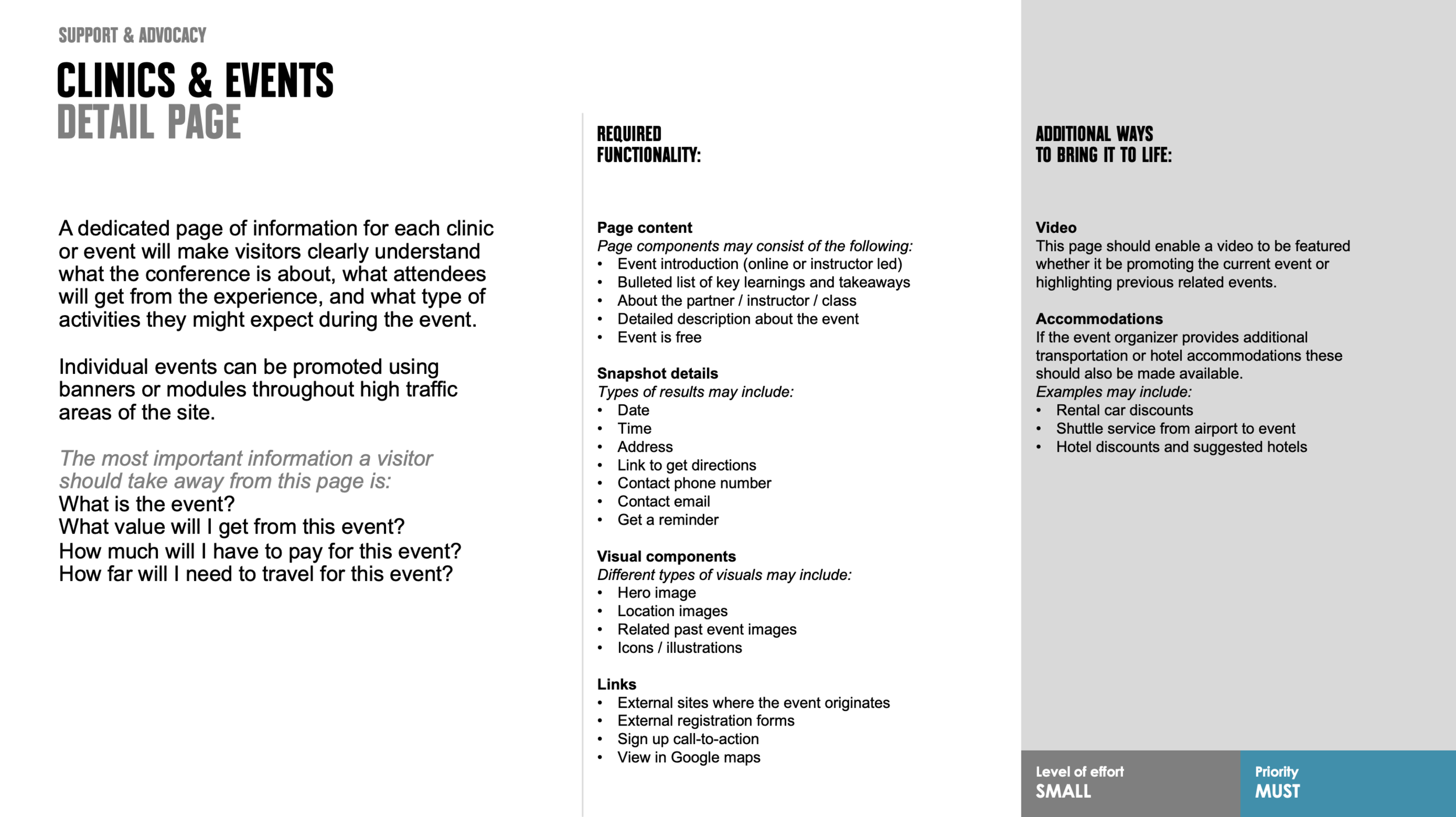
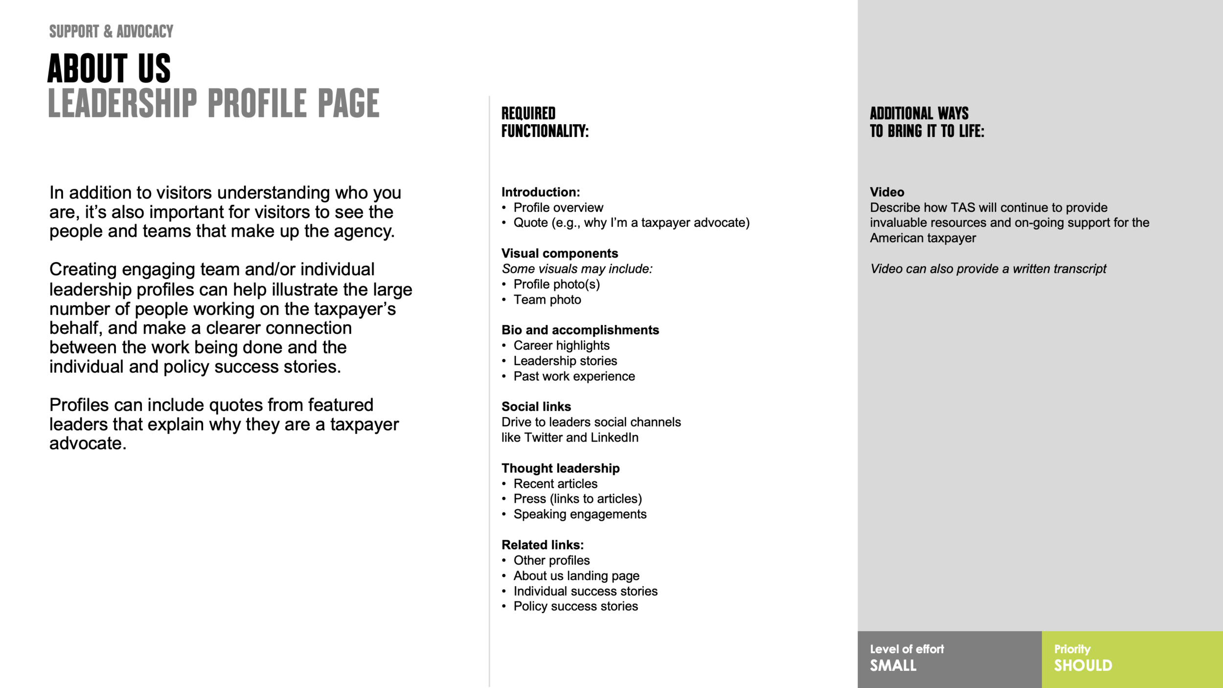
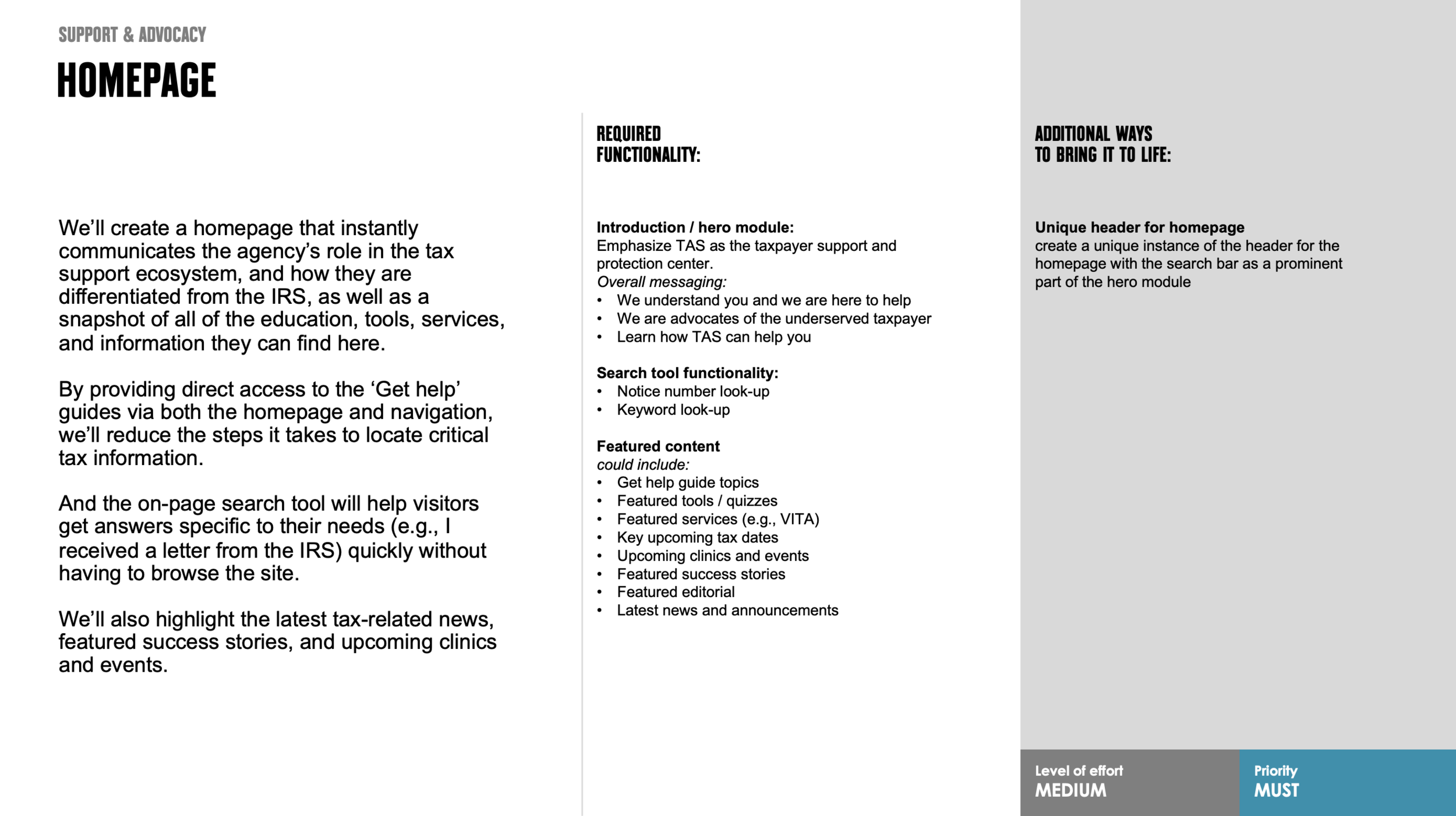
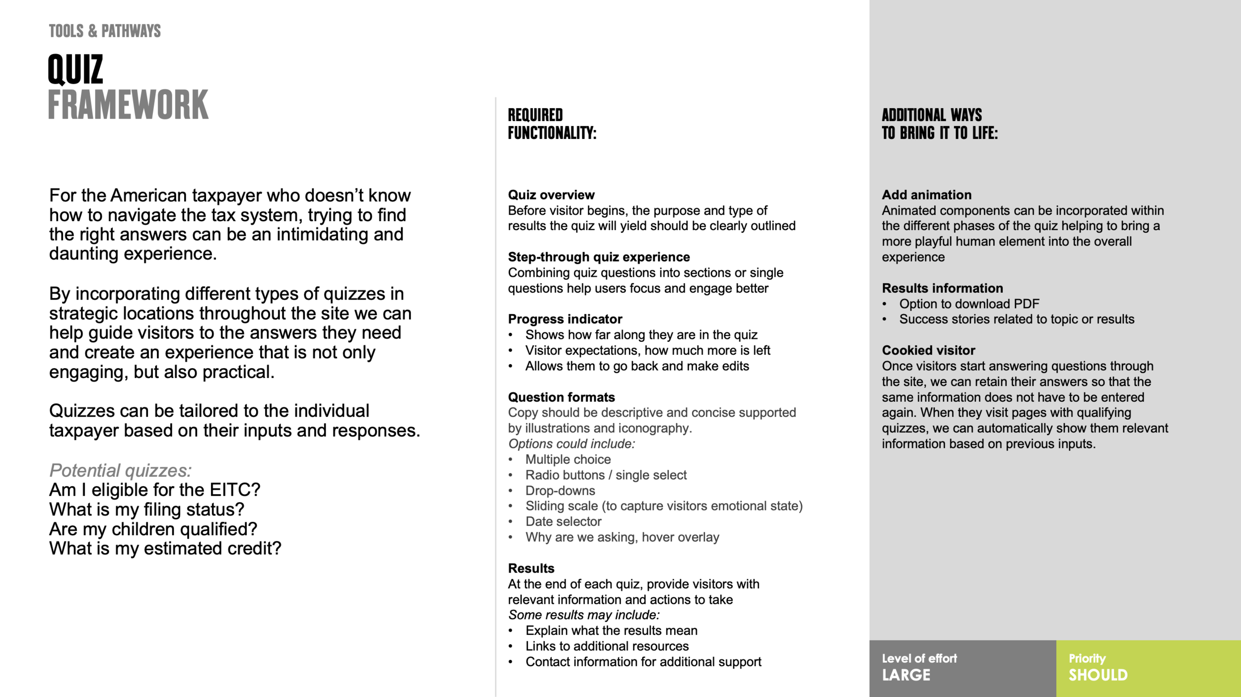
The development of the feature set was a collaborative team effort that was used to capture all the proposed features and key opportunities of our target audiences, the channels within our ecosystem and the overall tax landscape. We understood that not all features were possible within the project scope so each feature was assigned as a ‘must’ or ‘should’ and its corresponding level of effort to help our clients determine what features they wanted to prioritize.
click / tap feature set to view more
Phase 5
Information Architecture
This sitemap is a representation of the full site, taking into account all the pages, content, tools and actions that need to live in the site. It demonstrates how the site sections and pages are organized, their hierarchy and structure.
The top-level navigation uses key topics that allows visitors to quickly find the information they are looking for. Each section provides direct access to related content through secondary and tertiary pages to help them quickly locate information.
Templates Overview
We used a templated design system to create a shared language between all teams involved to ensure consistency and efficiency throughout the design and development process. The 14 templates would provide a defined set of rules and guidelines for how we design each page of the site. Our wireframes would dictate which modules and components could be turned on or off within the templates as needed.
Each of the color markers on the above sitemap correspond to the template outline featured below.
Phase 5
Creative Foundation
The creative foundation was developed in partnership with another creative agency and would serve as a comprehensive takeaway of our user experience and strategy that would be used as a guide for all designs created. Our team provided recommendations and feedback throughout this iterative process to gain alignment before it was presented to the client.
Voice & Tone
Defines the personality of the site and how the tone may shift depending on the type and context of copy
Color & Typography
Includes the primary and secondary colors, backgrounds and tones, font usage: headers, subheads and paragraphs
Imagery & Illustration
Bringing the experience and vision to life through photography, graphics, icons, and an illustration style
User Interface Elements
Standard interface elements including buttons, drop-downs, form fields, and key interface modules
Motion & Animation
An intuitive layer of communication to help with cognitive load and focus, while creating a more engaging experience
Phase 5
Site Shell
Our team developed the direction for the site shell that establishes the baseline template and grid for all sections of the site, their hierarchy, and where they live within the site experience. It’s comprised of the global header, footer, and navigation system for both desktop and mobile responsive breakpoints.
Desktop
Get Help: wireframe
Get Help: visual design
Resources for Taxpayers: wireframe
Resources for Taxpayers: visual design
Tax News & Information: wireframe
Tax News & Information: visual design
Our Reports to Congress: wireframe
Our Reports to Congress: visual design
Contact Us: wireframe
Contact Us: visual design
Mobile
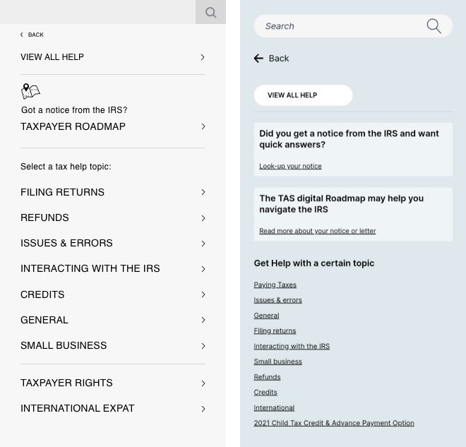
Get Help: wireframe / visual design
Resources for Taxpayers: wireframe / visual design
Tax News & Information: wireframe / visual design
Our Reports to Congress: wireframe / visual design
Our Reports to Congress: wireframe / visual design
Contact Us: wireframe / visual design
Footer
Footer: wireframe
Footer: visual design
Phase 5
Wireframes
Applying our learnings from the initial discovery phase we were able to successfully rework the current structure and hierarchy of content to meet the needs of our audience. We transitioned from a dated and cluttered site to an updated and modern user experience featuring intuitive pathways that enable users to easily find the information they’re looking for.
Before
Homepage
For Tax Pros
Reports to Congress
After
Homepage: wireframe
Homepage: visual design
EITC: wireframe
EITC: visual design
EITC Eligibility Status
These are all the different frames included in the EITC Eligibility Status questionnaire
Phase 6
Interactive Taxpayer Roadmap
The interactive version of the Taxpayer Roadmap allows a taxpayer to enter into it at any step and learn more about that step and the surrounding steps. The taxpayer can advance through the roadmap with a call-out mechanism that presents the user with legal context as well as their options to resolve the notice. Taxpayers are also presented with deeper explanations about their rights and alternative resolution mechanisms.
The below wireframes and corresponding functional annotations were provided to our development partners so they could understand how all the different features of the interactive Taxpayer Roadmap was intended to function.
User can enter their notice number or use the quick links to view by section.
The user’s notice number entry into the search field will be assisted by auto-fill and a list of notice numbers and their corresponding titles will appear below the search field as clickable quick-links.
Default view of map when a user arrives on the Taxpayer Roadmap page including the header, search search section and expanded explore menu.
+ / - feature enables a user to zoom in and out as needed
View of the map when a user begins scrolling down the page
The map “fills” the entire screen and the header and search section go away.
A “Search” tab appears at the top of the screen.
The “Close this view” CTA will close this view and bring back the original default view.
The overlay appears when the question-mark icon is clicked revealing the “How to use the Taxpayer Roadmap” information.
View of the map when a user clicks the search tab.
Search section appears
Search tab changes to “Close” tab
When close tab is activated it changes the map view back to full page and removes the search section
Collapsed view of the Explore menu and hover state for the clickable map markers (ie. Letter 12C)
This overlay appears when:
A user manually clicks on the map hover state overlays (as shown)
A notice number search is activated
This overlay includes the following features:
x-out to close
“next stop” changes the content within the overlay to the next available stop in the roadmap journey and the hover state overlay changes accordingly
Section of the map / eyebrow
Letter number / name
Notice overview
Download / share features and functionalities
CTA opens notice detail page


